EPark
- Part 1 - EPark
- Part 2 - EPark Rebuilt (Coming Soon)
The City of Edmonton has removed all the parking meters and replaced them with an electronic parking system called EPark. The EPark system allows you to pay at either a kiosk or through your mobile phone, which sounds awesome until you try to use the mobile app. EPark is an example of an application that had no usability testing done and very little thought put in to how users will use the application, which explains it’s one star ratting in the app store. In this post we will investigate some of the issues, in part two we will look at some solutions.
Login Screen
Login screens are very common in both mobile and web applications and the layout of a login screen is fairly standard. Login screens are a solved problem, they consisting of a user name, password and login button. EPark almost does this right, but in addition to having a login button it has a reset button and bizarrely it places the reset button first.
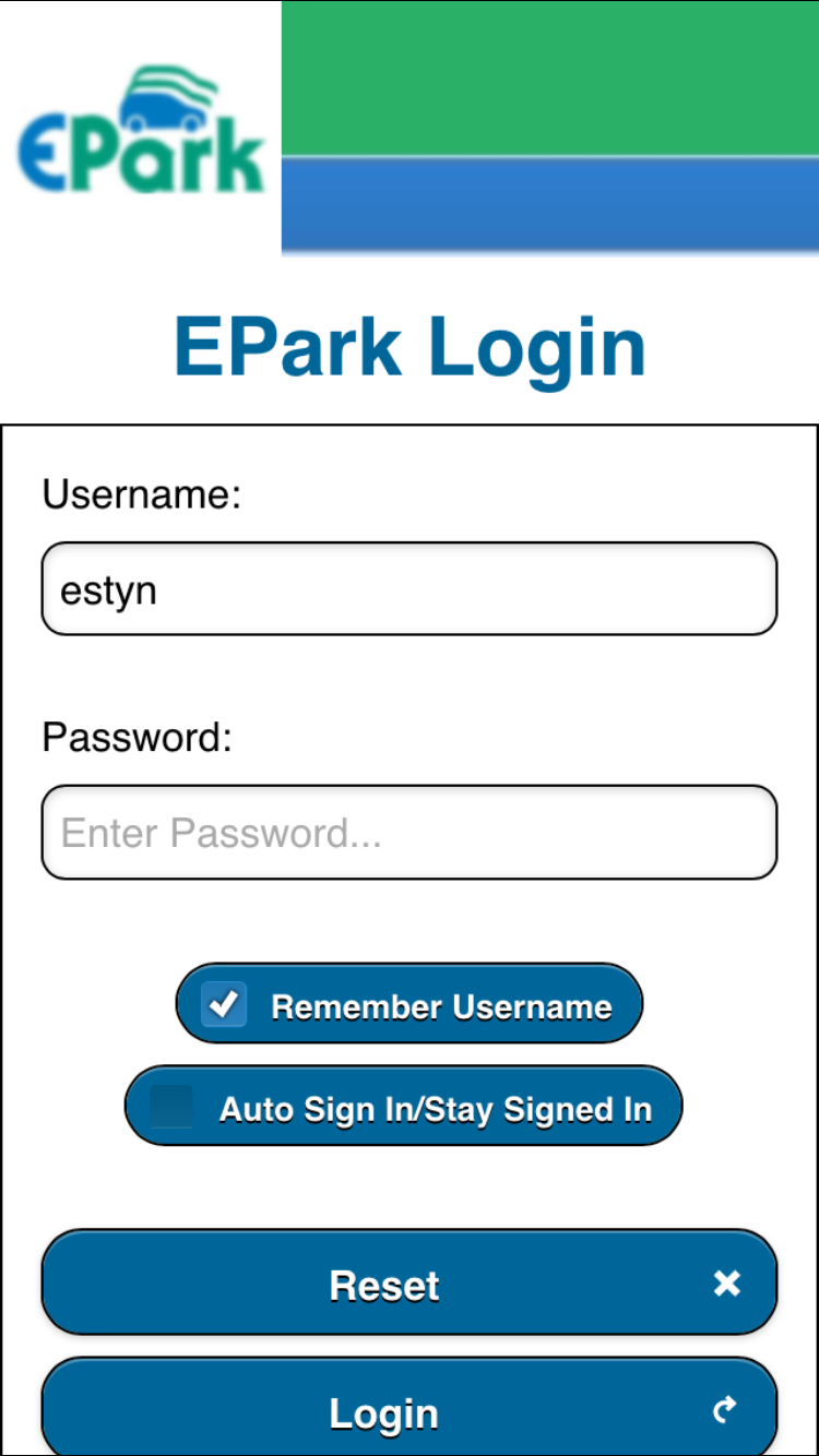
In fact the login button doesn’t show up on many mobile devices without scrolling making the login process particularly confusing. The reset button is completely unnecessary and I would argue that the remember username is also not needed. Simplifying the user interface would make login in easier for users.
User Onboarding
The create account link creates a modal dialog which is generally a bad idea on mobile, and is a particularly bad choice when it is long enough to require scrolling. In this case a dedicated screen would be a better choice.
The sign-up process doesn’t prompt the user to add a mobile number or a license plate which is unfortunate as they are both required to use the system. I would rather see a wizard that would walk the user through the account creation process.
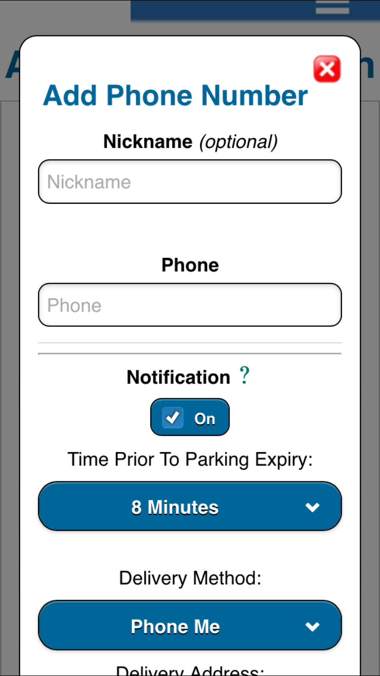
Mobile Number / Account Confusion
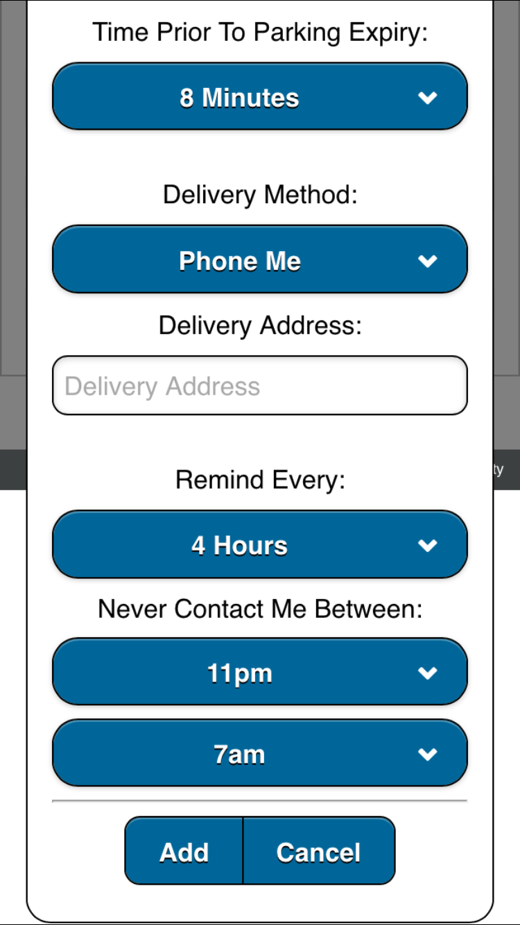
I have a hard time understanding why the system allows multiple mobile numbers the way they do. The mobile number also include settings around when to send reminders (even email reminders). It’s good that these settings exist, but it would make a lot more sense for these to exist on an account basis not a per number basis. The majority of users will have a single phone number and for those users that have multiple numbers it seems likely that they will want the same notification rules on both numbers.
It seems like they are using phone number to allow multiple users to share they same account, perhaps for business use, but this means that all the users sharing the account will share the same user name and password and will have permission to edit the other users. A better implementation would allow for separate user accounts that could share the same funds and have an administrator who could manage the overall account.
License Plate
The license plate entry is thankfully fairly straight forward, although the small vehicle promotion is problematic. The only additional confusion is the fact that license plates must be globally unique. This means that if a couple has two cars they cannot both have both cars on their accounts. It also means that I could in theory register someone elses car and prevent them from using the system.
Small Vehicle Promotion
If a vehicle is under a certain size it qualifies for a discount, unfortunately they do not say what size that is. If you try to save a vehicle with a size that is too large they display and error message, but frustratingly the error message also doesn’t display the size that is required. The only way to find out what size is required is to click on the question mark next to the promotion which then popups a non-dismissible modal.
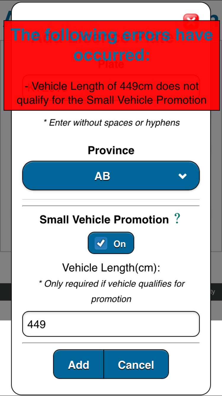
An additional frustration around the small vehicle discount is that the field is disabled if you have more than one license plate. There is no indication in the UI why the field is disabled, but if you have more than one license plate you cannot edit the field. I though the app was broken until I read the documentation.
UI Improvements
There are several places where small changes to the UI could lead to significant improvements, currently the app feels unfinished.
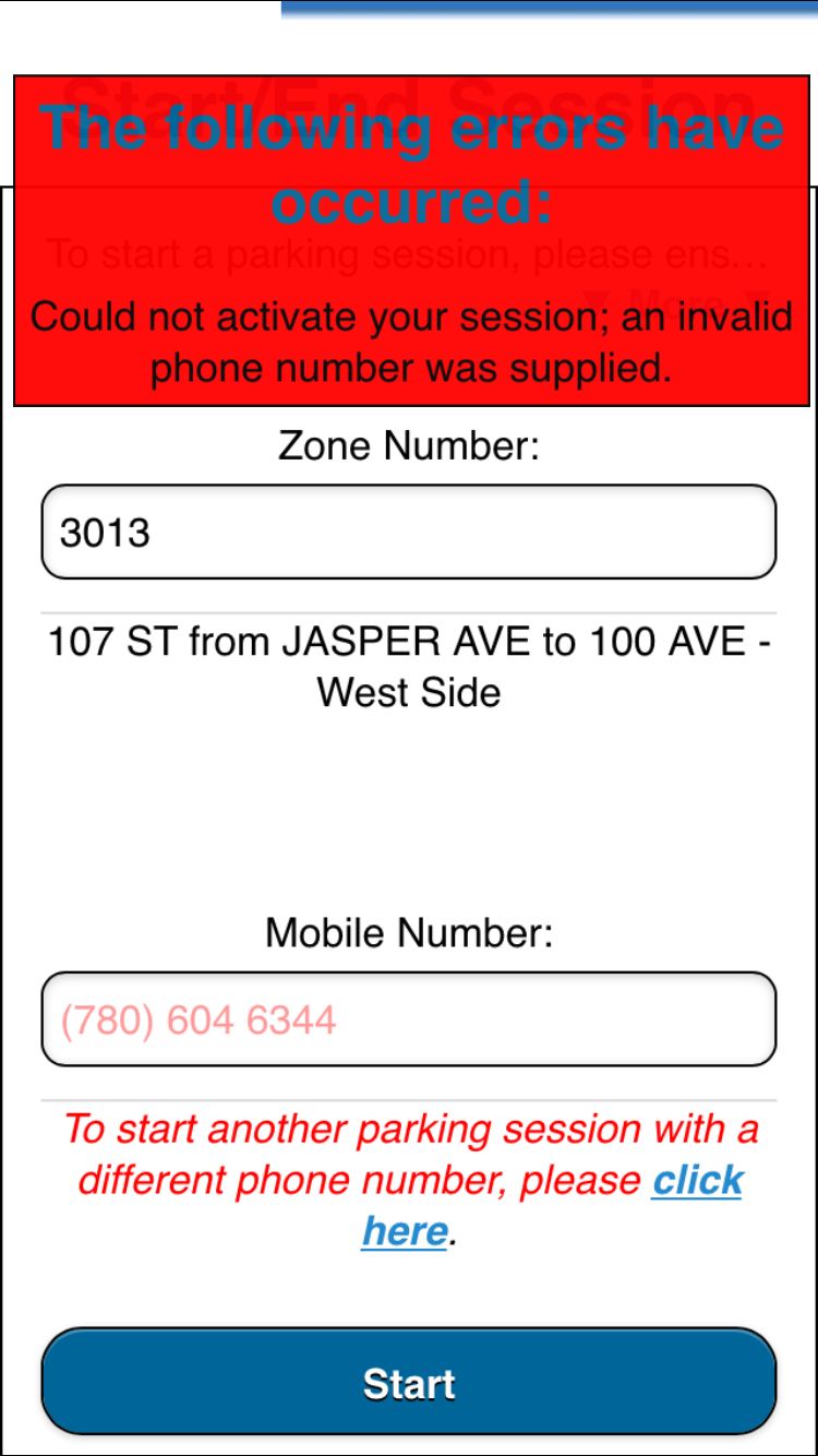
Error Message Text
This is the problem that sparked this blog post. When I was trying to start a session and I kept getting the following error message:
Could not activate your session; an invalid phone number was supplied.
After much frustration it turns out that my license plate was incorrect, not my phone number. The error message makes no sense and was clearly not tested properly. It’s particularly frustrating as the phone number is displaced right on the screen.
Error Messages
The error messages popup over the UI and there isn’t any way to dismiss them or access the UI underneath them. They do eventually disappear (after 20 or so seconds), but not before confusing and frustrating the user.
Logo
This feels a little nitpicky, but why is the EPark logo fuzzy? Could they not use a photo with the proper resolution?
Workflow
If an account has only one mobile number and license plate then we can stream line the process to avoid prompting for this information.
Zoom
If you accidentally pinch or double-click in the UI it zooms in like a webpage. It is quite confusing and serves no purpose. This can (and should) be disabled in mobile apps that are acting as native apps.
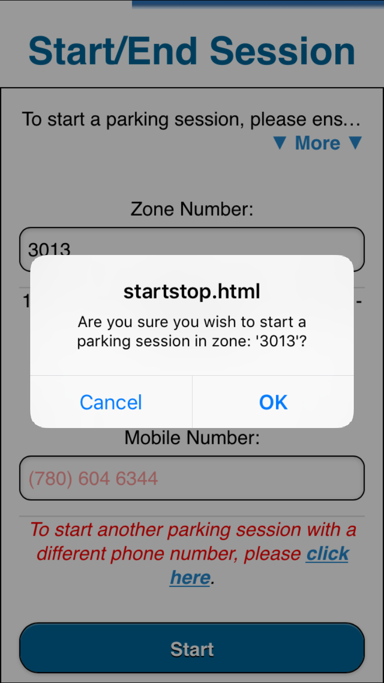
Dialogs
When you start a session the dialog message title is “startstop.html” not only is that not useful to users it is incredibly sloppy.